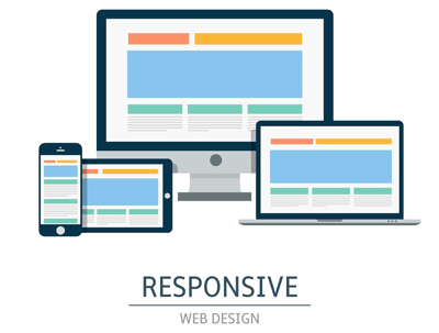
A few years back when we were designing web sites we had to recognise that the average screen size that people had on their desktop computers was getting bigger, and we had to take this into account when designing a web site. These days we have the reverse issue as more and more people are using mobile phones to access the internet.

For a number of our clients, whose web sites are particularly aimed at visitors on the Isle of Wight, this is especially important. People coming over to the Isle of Wight on holiday won't bring their desktop computer with them, and if they need to access the internet they are likely to do so on a mobile phone or tablet, and its important that your web site looks good on these devices.
There are a basically two techniques for ensuring that a web site looks good on mobile phones and tablets as well as on a desktop computer:
It is this second approach that we are using, this is known as responsive web design (RWD), where the web page automatically adapts its layout according to the size of the screen it is being viewed on.
RWD should consider two aspects to the site design:
Additionally there is one other aspect of designing for mobile phones which is not always considered - ensure that all elements of the page, particularly images, but also other parts which make up the page, do not have large file sizes.
Large file sizes take longer to load, particularly on poor mobile phone connections, and use up more of a users data allowance that might otherwise be needed.
Blog Archive
September 2023 (1)